When I first started my business there were so many things to think of, but I knew getting a brand in place was really importrant.
For the next year and a half I tried in vein to develop my brand. I actually worked with three designers, and as I was starting out I tried to go with the most cost effective option. I could not hit on that illusive idea to fulfil my vision and pin the brand down. I think the main problem was that I didn’t really know what I wanted.
I felt it was time to take a different approach. At the start of 2012 I attended a DEL funded project management course and this helped me to put in place a structure for achieving my goal of putting in place a brand and website that reflected me and my work.
I spoke to a friend who works for one of the world’s leading branding agencies and he helped me to put together a brand document. While time-consuming, it was well worth it as this helped me to drill down to the core of the brand and to get an understanding of the ethos of my brand.
I had been aware of the web and brand designer Melissa Love for quite some time and thought her work was fantastic. I had been considering approaching her to develop my brand and when I saw the website she designed for Zach and Jody Gray at WPPI. My mind was made up that Melissa was the person who could translate my vision into reality.
To hire a designer of Melissa’s calibre I knew I would need to make a significant investment and so I approached Raymond Usher at Invest NI who steered me toward funding opportunities. I managed to get 50% of the website and brand funded through a MIS grant and would strongly advise others to investigate funding opportunities in their area.
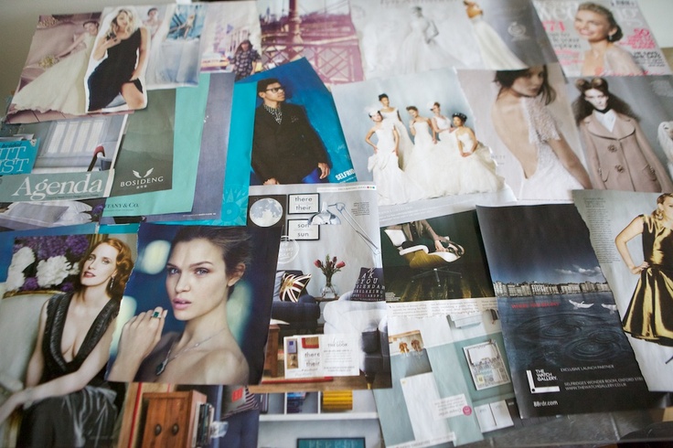
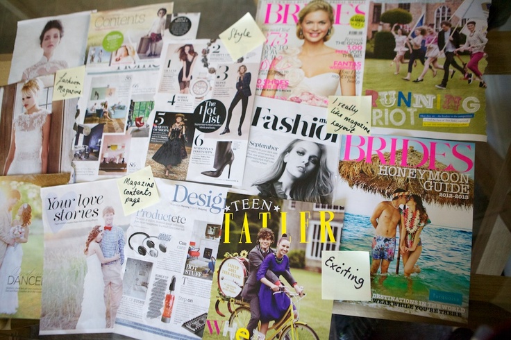
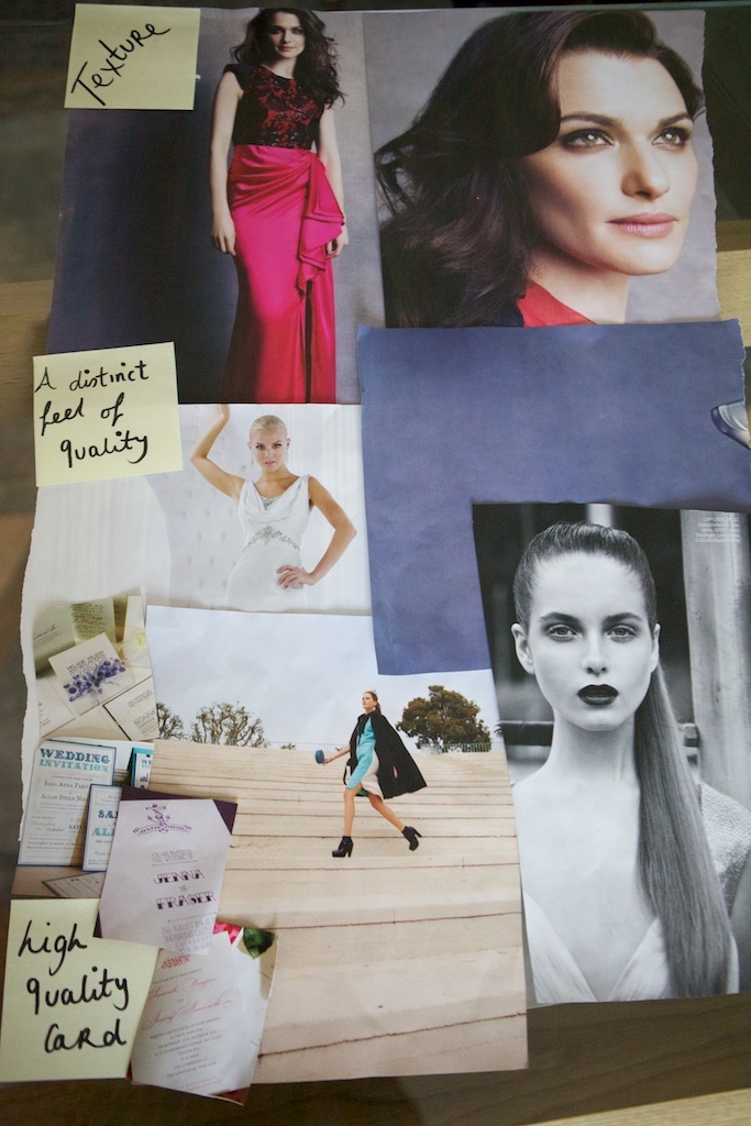
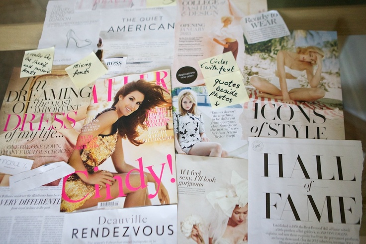
With funding in place I was really excited to begin to develop the brand last summer. The brand document was a great help as I already had a defined idea of my brand and now needed to match the visual identity to characteristics of the brand. The first step required me to pull together four mood boards, which represented my personal style, and the colours, textures and typography that I love.

Putting together mood boards was a fantastic exercise. It involved me ripping out pages from magazines and placing them in a collage, then taking a photograph of the compiled images. Strangely in this colour board I pulled out colours I was attracted to and once I put them all together felt they all belonged to a certain palette. Once I showed Margaret she laughed as she said that the colours reflect the colour of clothes I wear everyday!

On my style board I tried to reflect the style of my brand and what I am attracted to.

To me these textures give the feel of quality. They portray the professional style that I wanted.

I love the typeface/fonts used in fashion magazines and like the idea of overlaying text on images. I think the combination of serif and sans serif fonts looks cool.
In addition to filling out the mood boards I had to give a lot of information about the ethos of my brand and me as a person. I had found that many American photographers centre their business around themselves and appeal to customers on a personal level. I wanted this to come through and to approach clients in this way as I knew this would attract clients I love!
From these ideas Melissa developed a brand board as a starting point. When I saw this it completely blew my mind. I could not believe that this was my brand and how well it had come together. I absolutely loved it!

As the brand and site developed, Melissa referred back to me for input and to make sure everything was progressing in the right direction for my business. The brand development process was seamless and the finished product exceeded my expectations. You can view the finished site here.
Since launching the new brand and website so many other photographers and clients comment on how impressive it is and it has provided a boost in bookings, particularly from those based in Australia and USA. Most couples now book over the phone without meeting as the new site provides a lot of information about me, my business and my work.
In the past year I have worked with Melissa and her team to develop my blog to fit in with the brand and have worked closely with her colleague Luke to tie in other elements with my other collateral.
Putting in place a brand not only makes business sense, but I feel really proud of my brand and it gives you confidence when you are creating work and you are represented by a strong brand presence.
YOUR COMMENTS